
…who only England know?
*
[tl;dr If you aren’t interested in the ramblings and just want tips on using software, skip down to the next subtitle]
This question, bitterly asked by Kipling in his 1891 poem The English Flag, bemoans the “poor little street-bred people” who “yelp” criticism at the English flag. Kipling asserts that, because they have only known the succour of the motherland, they are ignorant of the sacrifices made in each of the four corners of the world to glorify the name of England. Those “who only England know” can only “vapour and fume and brag” and their criticisms of her Empire are those of ungrateful of spoilt children.
So, basically, Kipling’s a [insert amusing but not offence expletive here].
But while the poem is as embarrassing as a doddery old racist uncle, the phrase is interesting – when we are too close to something, we can’t see it. When something is normal it is invisible. Woods and trees and that.
The phrase came to mind recently when someone, not, I hasten to add, in the teaching profession, expressed the idea that Kids These Days were really Good At Computers because they were born with them and It’s All They’ve Ever Known. My friend even used the phrase ‘digital native’.
“Ahh,” I replied, despairing.
I realised that the anecdotes that might prove him wrong required too much explanation and were not nearly interesting enough to be useful in actually winning an argument on this point. At the same time I knew that that an argument on this point was not what he was interested in; he had merely said the thing that grown-ups are supposed to say when talking about kids and computers in order to fulfil the social obligation of responding with words to something I had said. He was merely keeping up his end of the conversation and, if I were to turn this into a proper debate about education, children, computing, technology or culture I would merely be laying an unfair claim on the precious, limited minutes we have on earth before our inevitable demise.
“Ahh,” I said. But inside, I was thinking about Kipling.
Because Kipling is right! Not about the Empire stuff (I listened when my mum told me it was mean to take other children’s stuff) but a native knows little about the country they live in. An English person who has never left these shores does not know how weird it is to consider ignoring people on a train politeness. They do not know that Americans often see our over-use of ‘please’ as condescension and bossiness; things a most English people would rather self-immolate than be considered. Until you have seen a different place, language or culture how can you make any judgements about your own?
So, what does a digital native know? What do they know of computers that only iPads know?
The problem is that Kids Today have only ever mashed the colourful buttons of familiar UIs on applications in carefully sandboxed environments, and therefore have literally no idea about how the shiny wizard-box works. The problem is that the natives don’t know what they’ve got. Kids Today Don’t Know They’re Born.
There is nothing inherently noble (despite what paunchy, bearded men in their late 30s might tell you) in having written an AUTOEXEC.BAT file or having created a HyperCard stack in the 1990s. There is no moral virtue in having inserted pokes into the code of a Spectrum game or instructed the BBC to GOTO 20 in the 1980s. There is, however, an advantage to having had had to deal with computers of a different generation. Having had to learn about command lines, floppy disks, hard disks, non-WYSIWYG word processors, RAM configuration gives you (and I am assuming that if you are reading this then you are of a generation that had to do some of those things even if the terminology is not familiar to you) a better understanding that computers are things that you can, and should, make do the things that you want them to do. If the past is a foreign country, then we are foreigners – immigrants into this world of post-skeuomorphic design where well-pitched algorithms, treating us like so much factory-farmed foie gras, encourage us into onanistic, self-referential cultural-gorgings in order to distract our bloated, fatty minds while they sell us down the river to sinister organisations (or organs of sinister states) who want to use our money and our votes for their own, increasingly surreal, ends.
So, before we resign ourselves to waking every night, sweaty and screaming, trapped in The Matrix / Blade Runner / Black Mirror / the Jetsons maybe we should think about how the machines could work for us. We are the perfect people to do it because we might, just about, remember when the machines did work for us. In the 1980s it might have taken twenty minutes to get the tape to load the program that would open the pod-bay doors but at least it would open the pod-bay doors when you asked it without selling your personal details to a foreign government.
Far, far, far too often in education people without enough knowledge, experience, time or aptitude make decisions about technology in schools without being aware of its implications on the staff and students who have to use it. The British education system is awash with software and websites for every possible part of school life. In the last year I have heard people in education say good and bad things about Quizlet, Show My Homework, Go4Schools, SIMS, Moodle, Floobaroo, GCSE Pod, Kaboodle, Dynamic Learning, Sporcle, Kahoot and Socrative to name but some. What worries me is that in very few of those conversations did I believe that the software was working for the teacher. Rarely was the software on their side. Rarely was the teacher was in control of the software. Instead, the software was controlling the teacher’s decisions and access to information, was trying to sell them something or was just a platform for advertising.1
Poorly designed software systems lead to poor practices, which give the poor teachers more work than is necessary, create poor ‘data’ on which poor judgements are made which affects the lives of the poor kids (and often poor, poor kids get the worst of it).
So, what I wanted to ask in this post is whether there are ways in which we should be using computers that might help us be better at teaching history. I don’t intend this post to be exhaustive and I haven’t time to promise a series but here is a start at asking the question: How much computing does a good history teacher need to know?
In this post, I want to suggest how one very common and very good piece of underused software can help you and your students.
[If you were after the short version start reading from here.]
Forget Outstanding – you want to Excel.
In the classroom…
The ubiquity and resolute ugliness of much of Microsoft Office belies the fact that actually some of the programs in the suite are actually really, really good. The best of the lot is Excel. It does what it is supposed to really quite well. One of those things that it does really, really well is pivot tables.
A pivot table is not one of those flimsy desks that schools only bring out at exam time but a way of quickly manipulating, and thereby analysing, data from a spreadsheet.
Using pivot tables can help your students make better analyses of data about the past and can make you a better analyst of data about students.
Let me give you an example…
Much has been written about the use of databases in the history classroom. The idea is simply that students can test historical hypotheses by looking at data from a database.
Perhaps the best example is by James Woodcock (@JamesVWoodcock) and Geraint Brown (@geraintbrown). They asked students to judge the impact of the First World War on the local area by using a database built from the information held by the Roll of Honour. Their significance enquiry was, “Was the First World War the ‘Great War’ for the local area?” They asked students to read an extract from EH Gombrich’s Little History of the World describing the First World War. They then asked students to infer why Gombrich thought the war was significant (i.e. students found quotations suggesting that Gombrich thought the war was ‘terrifying’, ‘ground-breaking’… etc.) Once they had identified some criteria by which WWI might be described as significant, students used a database about the local war dead to support inferences about whether those same criteria applied to the villages they came from.
This was a brilliant, tidy, thoughtful bit of planning that set the pupils an achievable task that was worth doing, that tied international and local history, that built on students’ previous work using evidence and that was planned in response to an on-going debate in the history-teaching community about second-order concepts (namely the work of Rob Phillips and Christine Counsell).
It ticks every box. I have literally never seen better planning… except that the database was on Microsoft Access.
Don’t get me wrong, Access has its place but this is not it any more. Since this work was first done there have been significant improvements in MS Office and some version of Moore’s Law even applies in English state comps. So, today, much the better option is to use Excel and the main reason for this is the ability to use pivot tables.
[NB The screenshots for this post are taken from Excel 2011 for Mac, Windows versions of Excel do the same things but may look slightly different.]
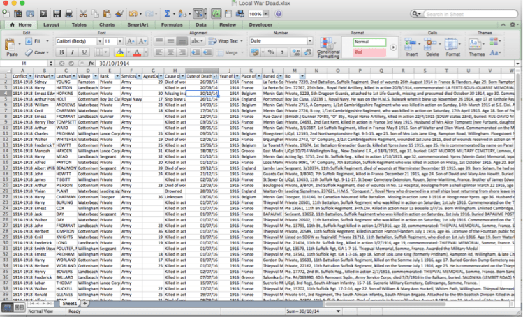
Here’s the data from Woodcock and Brown’s local war dead in an Excel file. As you can see from the little arrows in the blue boxes, a filter has been applied which would allow a student to filter or sort the information in the table. Currently, the data is organised in order of date of death. This is good. It allows a student to get rid of irrelevant information and look for patterns. So, if a kid wants to know whether the war got worse or better over time, they could look at the number of deaths in each year and begin to make inferences about what they data tells them.
However, much better is when all of the data is selected and a pivot table is inserted.

The idea behind a pivot table is that data can be plotted against other data quickly and easily. To do this, all the user has to do is drag ‘fields’ into the areas in the Pivot Table Builder.
So, let’s ask that same question using the Pivot Table. As you can probably see from the screenshot, I have dragged the ‘field name’ Year of Death into the Rows section of the Pivot Table Builder. The result is that my table now has a row for every year of death recorded in the database. I have also dragged the Age At Death field name into the Values section. I now have a ‘count’ of the number of Age at Death records for each Year of Death value. This tells me quickly that three men died in 1914, ten in 1915 and nine in 1945…
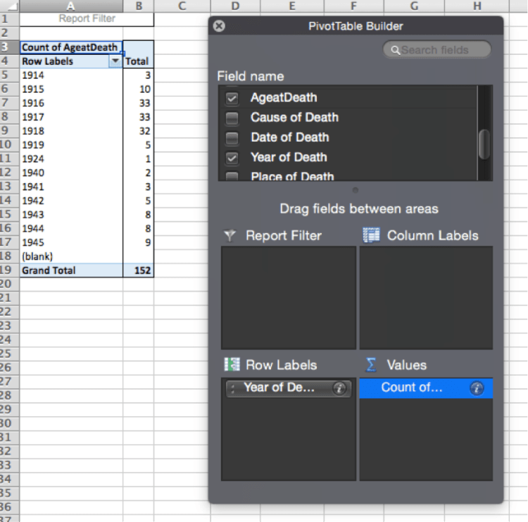
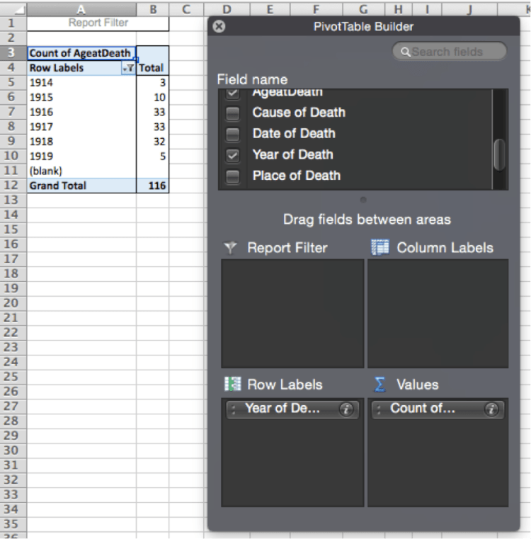
Nine in 1945? I seem to have Second World War records in my data. So, all I am going to do is click the little drop-down arrow next to the words ‘Row Labels’ on my table and un-select the dates I don’t want. Et voilà – a filter.
So, does things get worse for the local area over the course of the war? I can quickly see that they do – there are more deaths in the later years.
So, who is dying?
If I want to know more about the people dying in each year I can manipulate the data differently. By clicking the question mark next to the ‘Age At Death’ field name which is sitting in the Values section of the Builder I can change the data displayed. If I choose to summarise the data by average I can see the average age of death for each year… In three clicks!
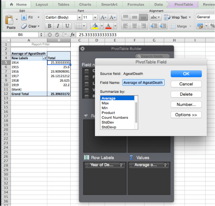
I can see that, in 1916 the average age of death drops below 24. If I drop the ‘Age At Death’ field back into the Values section of the builder I can see the count and the average.
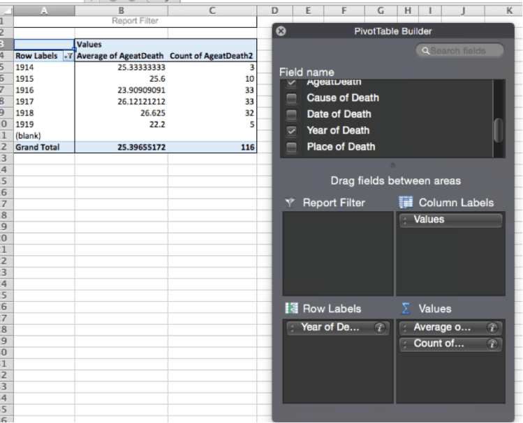
This tells me that the war is very different from 1916 onwards. Is this the effect of Kitchener’s Army reaching maturity? Is the age lower because these aren’t hardened professionals anymore but ordinary boys who volunteered?
To find out which records are involved in that average, all I need to do is double-click and Excel will create a table for me of all the relevant records.
I don’t need a Pivot Table to see that many of them died in France.
…but I’ve got a Pivot Table so I’m going to use it to find out more.
If I drag the ‘Place of Death’ field into the Columns section of the Builder I can whether the geographical spread changes over time.
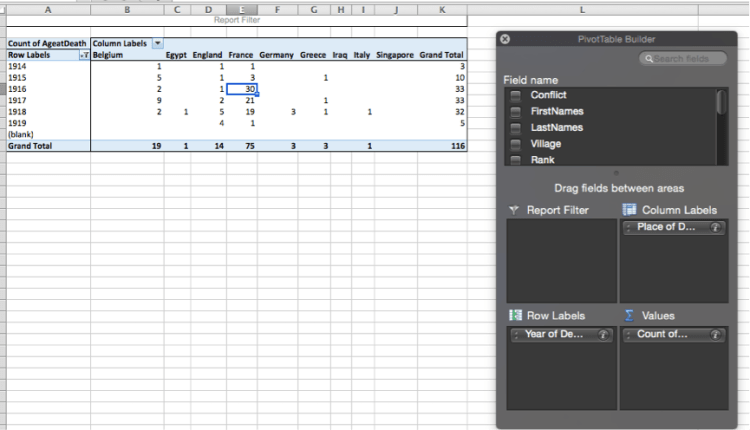
Again, that 30 men dying in France in 1916 looks interesting… double-click… Excel gives me the 30 records. Using the ‘find’ function (ctrl+f on Windows, Command + f on Mac) I can see that all but two of these men have the word ‘Suffolk’ in their biographies – all but two were from the Suffolk Regiment. Sorting the data tells me that 12 of them died on the first day of the Battle of the Somme.
I am not suggesting that Excel does anything new. I am most certainly not claiming credit for Woodcock and Brown’s work. All I hope I am doing is pointing out that helping our students to learn about pivot tables will make work like Woodcock and Brown’s more efficient and, therefore perhaps, more effective. Also, we are giving our students a valuable lesson in how to use a common, and commonly misunderstood, piece of software.
In the Office
So, having just ripped off Brown and Woodcock’s work, let me point out that you can use pivot tables to analyse your students’ data.
In this brave new educational world where ‘data’ needs ‘dropping’ and requires ‘management’ by ‘data managers’, where ‘accountable’ is another name for a stick to beat people, remember that you can use a pivot table to try and find some signal amongst the noise.
If you have the raw data it is just a matter of a few clicks to get a pivot table to tell you interesting things. If, in the dog days of summer, you are required to write the annual self-flagellatory confessional of a faculty evaluation. Why not use pivot tables to try and find out what factors really shaped your ‘data’. Did girls or boys with high prior attainment at KS2 do, on average, better or worse than predicted on Paper 1 and how did that compare to Paper 3…? The answer to that, and a million other questions can be yours!
However, it is not just pivot tables that can help. Assistant heads, keen to tell the damned and the saved, might ask you to look for auguries of the future. Instead of counting eagles or spilling entrails, you could use the following Excel formulas.
- CORREL – This formula gives the correlation between two data sets. If you ask Excel to calculate the correlation between, say, Year 7 test results and attendance, bad behaviour points, KS2 PA or reading age you can get an idea of which of those is most likely to affect a students’ attainment in history. The higher the number, the stronger the correlation. However, the cliché that ‘correlation is not causation’ is repeated so often because it is true. Your CORREL result will only give you a suggestion of the possible explanations of your students’ results2. It should raise questions rather than provide answers. If the strongest correlation is between reading age and test scores does your curriculum and/or your test need to be made more accessible? Are you asking the right questions about the way new vocabulary is introduced, used and tested? If the strongest correlation is between attendance and results that might mean that your lessons are effective and those that experience them benefit. If so, how can you support those who are absent? What can you do to help students catch up what they have missed? However, it might also that there is something else going on. What medical or social factors might absence be a proxy for? For instance, in your school do members of the GRT community have higher than average absence rates? Is your curriculum inclusive or exclusive of these kids? What is the role of the history faculty in addressing with this? What questions can, or should, you ask SLT about this?
- RANK – Let’s just skip past the arguments about 9-1 at KS3, zombie NC levels, any system peddled by publishing companies the tests… Any tests that you choose to measure (MCQs, essays, assessments, long-answers expressed through the medium of contemporary dance…) at Key Stage 3 are going to be particular to your school. The way you teach the Battle of Hastings is not the same as the way I teach it so even if we set the same essay they results are not easily comparable. However, you are much more likely to be able to make meaningful comparisons within your school. If your kids produce work that you score (whether or not you tell the kids that score or not) it is very unlikely to tell you, on its own, how well your kids are doing in comparison to a national standard. Any attempt to say “This Year 7 test is of a GCSE grade 6 standard” is meaningless3. However, it might be meaningful to say that Student X’s scored a grade that was 46th-highest in the year. It is certainly data that can be useful at a parents’ evening.
In Conclusion
A couple of years ago a colleague revealed to me that she thought the best thing about Excel was that it drew the boxes for you.
This gave me hope.
If someone can get the GCSE results she does and have that little understanding, what might be possible if we gave more time and attention to the computer programs that are often free and accessible to us and our students.
Besides which, we, as the immigrants to this cracked dystopian future have a responsibility to show the digital natives what alternatives look like. We need to show them a different way of using the tools around them that they might, one day, see more of the strangeness of their world.
1. As an aside, a software engineer from one of the above BETT-prize-winning companies, once openly told me in a minuted meeting that the reason that the software didn’t send me useful emails was because not giving them the information quickly forced teachers to spend longer on their website. I refrain from naming them because I can’t quote the idiot verbatim and have no written record. Suffice to say that the fact that their data tables don’t line up properly is but one of their problems.
2. If you choose to use these results disingenuously, select those that suit your purposes and over-state your confidence in them to win arguments with easily-confused managers who believe in flight paths, that is between you and your conscience.
3. Of course, as data accrues over the years, you may be able to infer something about future performance: when the kids who have sat your Year 7 test have also taken their GCSEs you might find some meaningful correlation between the two sets of results. Although, you might not, of course…
