We have a Year 7 enquiry question that asks students to consider the historical significance of four medieval women.
We’re pretty happy with it.
It allows us to cover some chronology that would otherwise be missing, introduces students to the idea that historical significance is ascribed rather than inherent, suggests some criteria by which historical significance may be judged, makes a moral point about the exclusion of some groups of people from conventional historical narratives, asks students to practise supporting claims with examples and allows them to, if they choose, to create some dramatic art work. It’s quite good fun and it sits nicely within a progression model of the second-order concept of significance planned into our Key Stage 3 curriculum.
Like I said, we’re pretty happy with it.
Teaching this topic this year, Maggie Johnson, one of our brilliant Specialist TAs from our Hearing Support Centre, said that she was concerned about the amount of substantive content there was in this course and asked if she could make an aide memoire to stick on the desk of a student with hearing difficulties so that she and the student could refer to it when signing. Feeling once again grateful to work with such amazing TAs, I said, “of course”.
Which is when Maggie, very politely, pointed out that the inconsistency of the pictures might actually prove to be an obstacle developing students’ understanding and that the pictures were, in short, rubbish.
Have a look at the pictures we were using…
Eleanor of Aquitaine…


…Julian of Norwich…
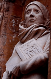
…Margery Kempe…

and Margaret of Anjou…


It’s not the fact that Eleanor of Aquitaine appears to be riding a My Little Pony that was the problem. Nor was it that the picture of Margaret of Anjou is from the ‘wonky’ school of art that was so popular in the medieval period – it’s that there is no consistency between the images. Three of the pictures are modern artistic impressions, two are from medieval manuscripts, one is from a medieval mural and one is a twenty-first century photograph of a twenty-first century statue. The images not only look radically different from each other, the intentions behind their creation are radically different. Yet, we were going to use them to try and help Year 7s learn about women who, as far as they are concerned in this enquiry, are of the same order: they are all medieval women, they are all objects of our study and they all will be subjected to analysis of their potential historical significance. Whether explicitly or implicitly, the pictures did not suggest that parity.
If we wanted students to understand that the women were of the same order we needed to have pictures that made this clear – we needed consistency in our dual coding.
We rectified this problem by drawing our own pictures.
We projected the images onto a whiteboard and went around them with a dry-wipe marker. We then took a photo of our drawings, emailed it to ourselves and tidied and coloured jpeg with Photoshop. Below are the results:

The images we have created are certainly not more beautiful than (some of) the originals but they are at least consistent – images that represent things (in this case, medieval women) that are of the same importance, and will be studied and analysed in the same way, now look the same.
However, they are not exactly the same. They still have visual clues that might act as cues to remembering a little about these women’s lives – the queens are wearing crowns, Julian of Norwich is dressed as a nun and Margery Kempe is holding her imaginatively-titled autobiography, The Book of Margery Kempe.*
For me, the take away from this experience was that consistency in the images you use has more than just aesthetic value…
…and that there are people who paint pictures of medieval queens riding fantasy horses and post them on the internet.
* I realised later that we would need to correct the image of Margery Kempe before teaching this again next year – one of the things she does that gets her into trouble with the Mayor of Leicester is wearing white despite being a married woman.
